1/6


Material Design Color
1K+ดาวน์โหลด
2.5MBขนาด
4.0(17-04-2021)เวอร์ชั่นล่าสุด
รายละเอียดรีวิวเวอร์ชั่นข้อมูล
1/6
คำอธิบายของMaterial Design Color
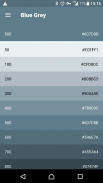
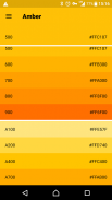
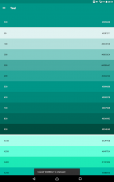
สี:
สีในการออกแบบวัสดุที่เป็นแรงบันดาลใจเฉดสีหนาวางกับสภาพแวดล้อมที่เงียบเงาลึกและไฮไลท์ที่สดใส
จานสี:
จานสีนี้ประกอบด้วยสีหลักและสำเนียงที่สามารถใช้เพื่อประกอบการอธิบายหรือการพัฒนาสีแบรนด์ของคุณ พวกเขาได้รับการออกแบบให้ทำงานได้อย่างกลมกลืนกับแต่ละอื่น ๆ จานสีเริ่มต้นด้วยสีหลักและเติมในสเปกตรัมเพื่อสร้างจานสีที่สมบูรณ์และสามารถใช้งานได้สำหรับ Android, เว็บและ iOS Google แนะนำให้ใช้ 500 สีเป็นสีหลักใน app ของคุณและสีอื่น ๆ เช่นสีสำเนียง
ออกแบบโดย Eajy ในประเทศจีน
Material Design Color - ข้อมูล APK
เวอร์ชั่น APK: 4.0แพ็คเกจ: com.eajy.materialdesigncolorชื่อ: Material Design Colorขนาด: 2.5 MBดาวน์โหลด: 143เวอร์ชั่น : 4.0วันที่ปล่อย: 2024-05-30 15:46:27หน้าจอขั้นต่ำ: SMALLCPU ที่รองรับ:
ID ของแพคเกจ: com.eajy.materialdesigncolorลายเซ็น SHA1: 46:0C:C4:69:63:B6:51:25:41:82:49:DE:1D:94:6A:85:78:0A:B6:7Cนักพัฒนา (CN): Eajyองค์กร (O): ท้องถิ่น (L): ประเทศ (C): 86รัฐ/เมือง (ST): ID ของแพคเกจ: com.eajy.materialdesigncolorลายเซ็น SHA1: 46:0C:C4:69:63:B6:51:25:41:82:49:DE:1D:94:6A:85:78:0A:B6:7Cนักพัฒนา (CN): Eajyองค์กร (O): ท้องถิ่น (L): ประเทศ (C): 86รัฐ/เมือง (ST):
เวอร์ชั่นล่าสุดของMaterial Design Color
4.0
17/4/2021143 ดาวน์โหลด2.5 MB ขนาด
เวอร์ชั่นอื่น
3.9
8/6/2020143 ดาวน์โหลด2.5 MB ขนาด
3.8
28/2/2020143 ดาวน์โหลด2.5 MB ขนาด


แอปในประเภทเดียวกัน


English


